by Jacqueline Lichtenberg
Copyright 1998 by Jacqueline Lichtenberg. All Rights Reserved. Part of Companion In Zeor #13
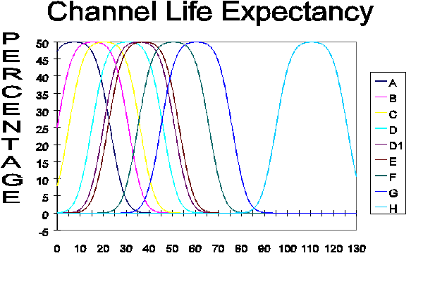
This chart was done for Zelerod's Doom but as background, not to be published. This one pertains to channels, but the same basic principles apply to renSimes and even Gens, though the numbers of years and details of lifestyle might vary. A Chart like this couldn't possibly exist in the time of Zelerod's Doom -- it takes Unity, long record keeping, lots and lots of data on lots of people living vastly different lifestyles to get a complete picture of what's really happening. It takes more individuals in a study to get a statistical picture where Simes and Gens are concerned because of the even greater genetic variances among Simes and among Gens -- and the fact that (if you start trying to do this too early in the mutation) you are still seeing new submutations appear and muddying the picture. You have to compare apples to apples to find out how root grafting affects apple shelf-life. If you count some oranges as apples, your numbers won't make sense.
Draw a long horizontal line across the paper (screen?)
Put 9 overlapping Bell Shaped distribution curves along that line so the peaks of the curves are distinctly separated, but the lower assymptotic skirts deeply overlap -- so that the front end of one curve is under the center of the next one. Put the 5th one of these curves much closer to the 4th one -- only 5 years on the scale separate them, while the other curves have a typical distance of 10 years or so from them. The tops of the bell curves can be a little flattened if you're that good an artist (I'm not, mine are all very irregular looking, to put it kindly.)
TIME (or AGE) is the horizontal axis here. The vertical axis is the number of individuals in a population that reach that age. Each distribution curve represents a lifestyle that tends to produce the corresponding life-expectancy.
At the end of the line on your left side, put a vertical line and label it CHANGEOVER. The ages are in years after changeover.
Now, from the peak of each curve, draw a vertical line down below the horizontal line so you can label the vertical lines and thus the peaks. The peak represents the age at which the majority of that population would die. Or put another way -- life-expectancy.
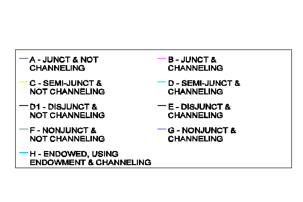
The first peak to the right of the line labeled CHANGEOVER is labeled A. The last peak on the far right of the paper (screen) is labeled H. 9 of them altogether but there are two labeled D. Remember, these lifestyles pertain only to channels.