My reply:Great Eric.. Its coming right along!
Two thoughts to consider...
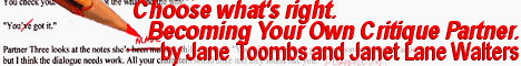
One is to play around with the justification of the text..
Left Justify the top line, leave the second line centered, then small down and right justify the bottom line.
Although the title is the point of the banner, the "hook" is the top line, so shoving it over to the far left of the section you've created is one way to make it get first look. Another is to move the line just a little further left than the section you've created, although that might make it look a bit sloppy. Give ema try and do what you think looks best.
The other is the background of the image behind the text. You will definitely want to remove it completely where it exists beneath the red text. Might also want to make the borderline between the image portion and the text portion "fade out" to the solid colored background. Be sure to leave enough transition room between the pencil text, and the red text.
VERY GOOD catch in keeping the pencil text to the LEFT of the pencil. very nice touch.
You're doing very well, Eric.
Thanks for handling this...
Patric
I thought about the justification and the background, but since I really could make neither heads nor tails of the true significance of the first line, I left it how you saw it.
As for the background, since I have no method of a gradient transparency, and the text was meant to be legible (as per your last message), I put a 50% transparent block behind the text to make it more legible. This is also why all of the text was "kept" that was on the left of the pencil. When I cropped the image, I cropped to a 77 pixel height. To maintain a proper aspect ratio, I needed to add more solid color to the right edge, which was where I assumed the text was going.
Considering that the pencil, red text, and text are meant to be included, it looks
this is about as good as I am going to do with this incarnation.
- Eric.
Attachment: (image)