Waiting for Reply from Patric, but if you can POSSIBLY fit in the "Choose what's right" on the first line, then the book title, then the authors...that would be fantastic. It looks great, but I think she wants the extra line on there if it is do-able. LISA
Hey Eric...
Somewhere along the line you will get a message from Lisa with the final text for the banner. It will be a single panel as she mentioned in one of your messages..
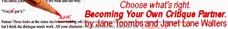
Something like : Choose what's right.
Becoming your own critique partner.
by Jane Toombs and Janet something or other.
Thats from memory so keep an eye out for her reply.
Also, I kinda figured you'd go for the pencil. Its the most visually interesting part. Suggestion: Crop the pencil point larget so the black word, and the red word above it are more legible. In other words, zoom in on that section so just enough of the yellow shows to make it obviously a pencil, and center in on the point and those two words. That will give you more visual impact, and will also communicate clearly to anyone whose ever dealt with an editor. That red strikeout is a dead giveaway. :)
And since its a single panel, there is no reason you couldn't extend the background of the image to also be the background of the text.
Something to explore, anyway.
Feel free to toss me another look if you want, but you've already got a great start on it. Nice job.
Patric
(Ah.. Heres the message from lisa with the confirmation on the "choose whats right" line. Great.)
Take 3.
- Eric.
Attachment: (image)